



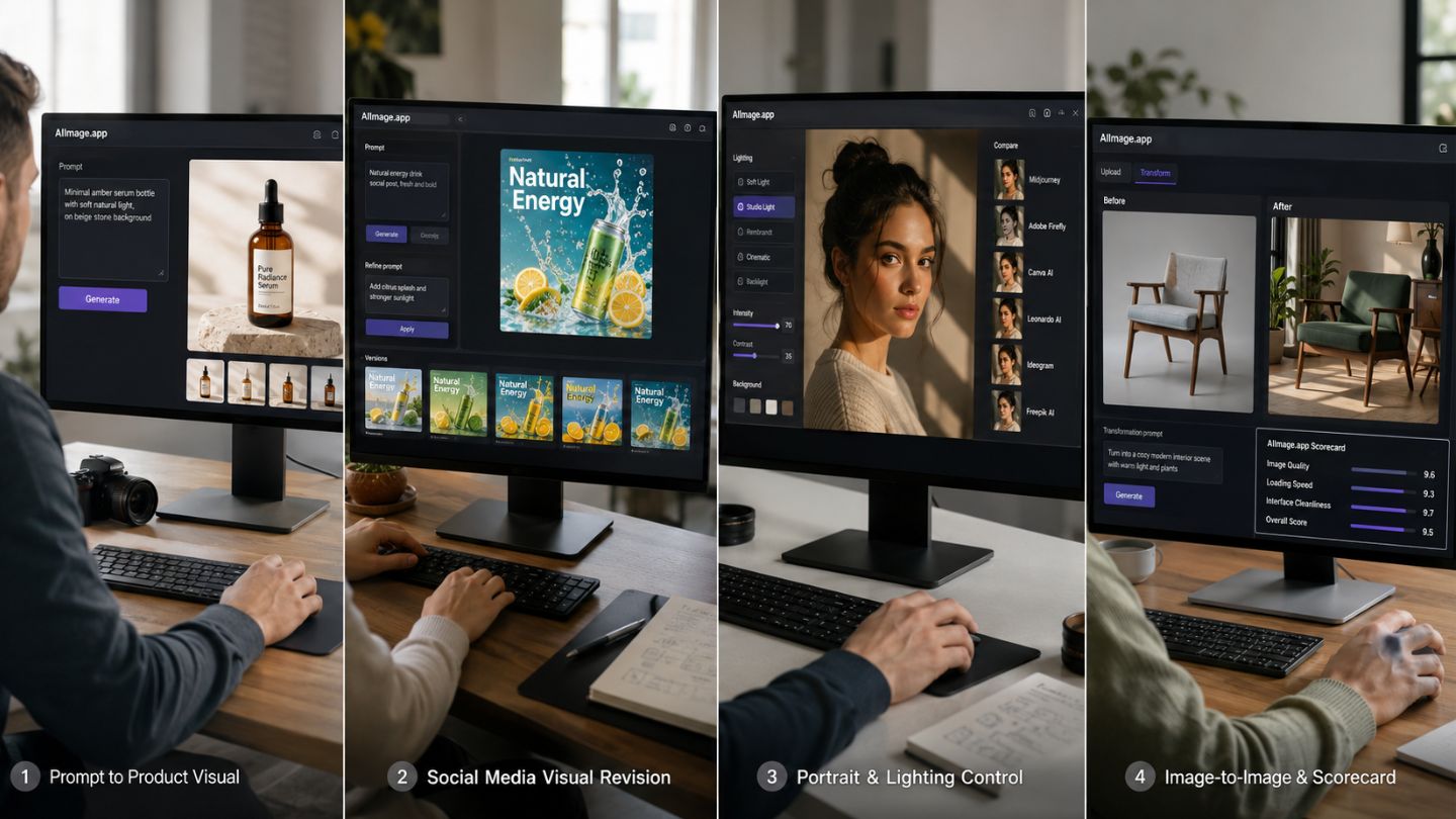
I started this round of testing with a slightly different question from the usual one. I was not asking which platform could create the most dramatic gallery image. I was asking which one helped me move from an unfinished idea to a usable visual with the least emotional friction. That is where AI Image Maker became interesting, because AIImage.app felt less like a showcase site and more like a practical place to keep working.
The problem with many AI image platforms is that they are built around amazement. They show beautiful examples, dramatic lighting, futuristic portraits, and polished fantasy scenes. Those examples are useful, but they do not answer the daily question a creator faces: can I make a product visual, adjust it, try a new style, upload a reference, and still feel in control after the third attempt?
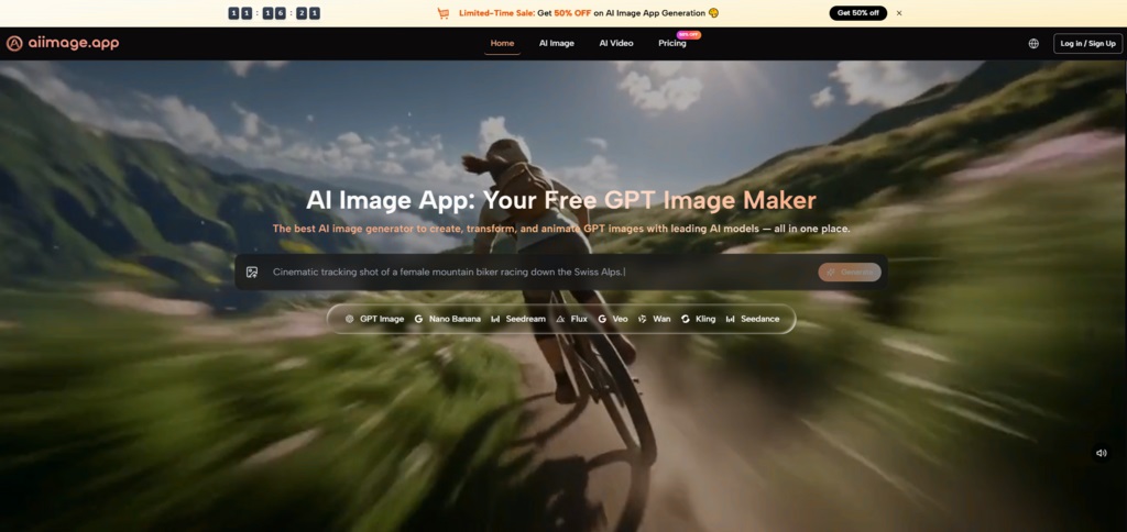
That question became the center of my test. I compared AIImage.app with Midjourney, Adobe Firefly, Leonardo AI, Canva AI, Ideogram, and Freepik AI. I used a mix of realistic prompts, marketing-style tasks, social media visual concepts, and uploaded-image transformation tests. I also watched the less glamorous details: loading behavior, interface clarity, ad distraction, and whether I wanted to keep using the platform after a failed result.
By the fourth paragraph of my notes, GPT Image 2 became the model reference I used when thinking about structured image output. I am careful with that phrasing because no single model solves every creative problem. Still, AIImage.app presents it as an option for more structured and detailed image generation, and that made sense when I was testing images that needed composition discipline rather than pure surprise.
What surprised me most was not that AIImage.app produced usable images. Many tools can do that now. What surprised me was how steady the experience felt across different tasks. The platform supports text-based image generation, uploaded-image transformation, image-to-image style workflows, and video-related creative directions. That made the site feel broader than a prompt box but still understandable enough for repeated use.
Why Productivity Became The Main Test
A good AI image tool should not make the user feel like every generation is a gamble. Of course, AI image creation always involves uncertainty. Prompts may be interpreted differently than expected, details may shift, and certain visual styles may need several attempts. But the platform itself should reduce that uncertainty rather than add to it.
That is where productivity becomes a better measurement than excitement. A platform that generates one stunning image but makes revision awkward may be less useful than a calmer tool that gives you solid results again and again. In my testing, AIImage.app performed well because it made the basic creative loop feel repeatable.
The loop was simple: describe the visual, generate a result, notice what changed, adjust the prompt or reference, and try again. That sounds ordinary, but ordinary is exactly what makes a tool useful in real work. If the platform turns every small change into a new puzzle, the user loses momentum.
Testing Across Practical Creative Jobs
I divided my test into five everyday creative jobs. The first was a clean ecommerce product image. The second was a square social media visual. The third was a portrait with a specific lighting mood. The fourth was a simple educational illustration. The fifth was an uploaded-image transformation task where I wanted to preserve the original idea while changing the style.
Why I Avoided One Perfect Prompt
I did not use a single highly polished prompt to judge the platforms. That would have made the test too artificial. Instead, I used prompts that looked more like real user instructions: specific enough to guide the model, but not so perfect that they removed the need for platform judgment.
The Hidden Test Was Revision
The real test was revision. After the first result, I changed a few words, adjusted the subject, shifted the color direction, or uploaded a reference when the workflow supported it. Tools that looked strong on the first image sometimes became tiring by the fourth attempt. AIImage.app held up better because the experience stayed clean and the creation paths remained easy to understand.
The Multi Platform Scorecard
The scores below reflect my overall testing impression. They are not meant to be scientific measurements, but they show how each platform felt across repeated creative use.
|
Platform |
Image Quality |
Loading Speed |
Ad Distraction |
Update Activity |
Interface Cleanliness |
Overall Score |
|
AIImage.app |
8.8 |
8.7 |
8.9 |
8.6 |
8.9 |
8.8 |
|
Adobe Firefly |
8.4 |
8.3 |
8.5 |
8.3 |
8.7 |
8.4 |
|
Midjourney |
9.1 |
7.4 |
8.8 |
8.5 |
7.1 |
8.3 |
|
Canva AI |
7.9 |
8.7 |
8.1 |
8.0 |
8.5 |
8.1 |
|
Leonardo AI |
8.5 |
8.0 |
7.4 |
8.2 |
7.7 |
8.0 |
|
Ideogram |
8.2 |
8.1 |
8.0 |
8.0 |
8.0 |
8.0 |
|
Freepik AI |
7.9 |
8.1 |
7.8 |
7.8 |
7.9 |
7.9 |
AIImage.app ranked first because it did not depend on a single standout category. Midjourney scored very strongly in image quality for certain artistic tasks. Adobe Firefly felt polished for users who prefer design-oriented workflows. Canva AI remained convenient for fast layout-driven content. But AIImage.app gave me the best balance between quality, speed, cleanliness, and repeatable creative control.
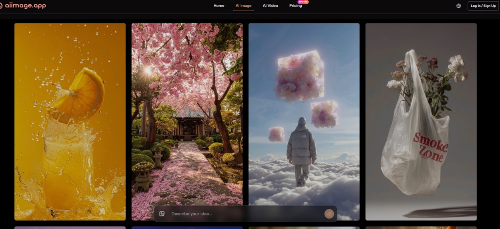
What AIImage.app Felt Like In Real Use
AIImage.app’s strength became clearer when I moved across different kinds of work. I could start with a written prompt when I had no reference image. I could upload an image when I wanted transformation or variation. I could think in an image-to-image direction when the goal was not to start from zero, but to reinterpret something already visible.
This matters because many creators do not work in straight lines. A person may begin with a text prompt, then realize that a reference image would make the direction clearer. A marketer may generate a clean product visual, then need a softer social media version. A student may create an educational image, then want a more polished version for a presentation. A good platform should support that movement.
The Interface Did Not Create Extra Work
The interface felt useful because it did not constantly demand attention. Some AI tools feel crowded, even before the user has generated anything. AIImage.app felt calmer. That does not mean every output was perfect. It means the product did not make the process harder than necessary.
Why Calm Interfaces Improve Results
A clean interface improves judgment. When the page is too noisy, the user may rush decisions or abandon promising drafts too early. When the interface is calm, it becomes easier to compare outputs, revise prompts, and decide whether a result is truly usable. This is one reason AIImage.app felt stronger over time than it did in the first few minutes.
A Simple Workflow That Stayed Clear
The official process is easy to translate into a working routine, which helped during testing.
The Four Steps I Used Repeatedly
-
Choose an image, image editing, or video-related creation path.
-
Enter a prompt or upload a reference image when the project needs one.
-
Select an available AI image or video model when appropriate.
-
Generate, review, compare versions, download, or continue refining.
This workflow is not complicated, and that is the advantage. The platform does not require the user to understand a technical production pipeline before creating something. It gives enough structure to guide the task while still leaving room for visual experimentation.
Where Other Platforms Still Have Advantages
I do not think AIImage.app makes every competitor unnecessary. Midjourney can still feel more visually dramatic for certain art-driven prompts. Adobe Firefly may remain attractive for people already using design ecosystems. Canva AI can be faster for users whose final goal is a social post or presentation layout. Leonardo AI and Ideogram may appeal to users who enjoy exploration and prompt experimentation.
The point is not that those tools are weak. The point is that their strengths are more situational. AIImage.app’s strength is broader. It feels like the tool I would choose when I do not know exactly what the project will become yet.
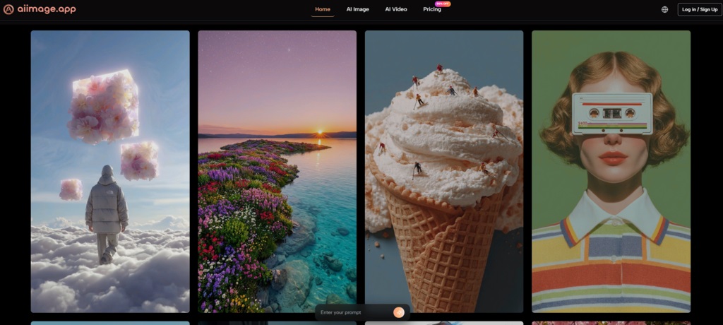
Limitations And Best Fit Users
AIImage.app still requires prompt judgment. If the user writes vague instructions, the results may still need revision. If the user wants a highly specific visual style, another platform may sometimes create a more striking first result. If the user is already deeply committed to a particular design environment, switching platforms may not feel necessary.
But for creators who need a balanced image workflow, AIImage.app makes a strong case. It is especially suitable for marketers, small business owners, content creators, students, bloggers, and independent makers who need images repeatedly rather than occasionally. The official site also presents some plans as suitable for commercial creative use, no-watermark output, and ads-free experience, so it appears to be positioned for people who may want practical production rather than only casual experiments.
Why I Would Keep It In My Workflow
I would keep AIImage.app in my workflow because it reduces the gap between idea and usable draft. That gap is where many AI tools lose users. They look powerful, but the process feels unstable.
The Strongest Point Was Consistency
Consistency is not as exciting as a viral demo, but it is more useful. AIImage.app did not win my comparison by producing the loudest result. It won because it made repeated visual work feel easier to continue. For most creators, that is the difference between a tool you test once and a tool you actually keep using.





Comments 0
No comments yet. Be the first to start the conversation.