



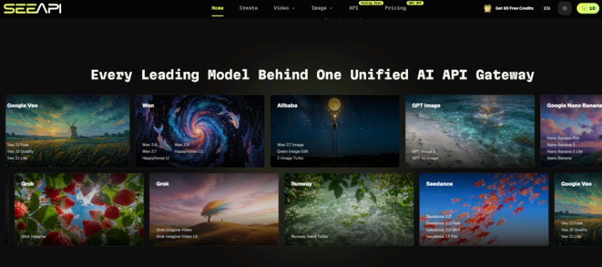
A college listing page can look busy and still fail to explain what a student will actually learn. Banner art, subject icons, and “day in the lab” images often get approved because they look energetic, not because they survive a mobile scroll beside fee notes and admission deadlines. That is why AI Image API is worth using as a controlled review loop before a school team locks one visual style for an entire program catalog.
The practical question on an education desk is narrower than model fashion. Can one image carry a single learning promise, stay readable on a phone, and be revised when the syllabus wording changes next term? SeeAPI helps that practical question by letting a content team generate, edit against a reference, and compare image lines in one online workspace before anyone argues about which vendor account to keep.
Program Pages Fail When The Visual Cannot Teach One Promise
Course marketing often mixes three jobs in one asset: attract attention, hint at prestige, and explain the subject. Those jobs collide. A dramatic campus skyline may win a click and still leave the student unsure whether the program is coding, design, or general studies. A decorative molecule graphic may look “scientific” while teaching nothing about the lab sequence described in the brochure.
The hidden cost appears after the page is live. Admissions staff answer the same clarification questions. Faculty ask why the public image does not match the first-week lecture. The content team then opens a new generator tab and starts over, because the first asset was never built around a teachable claim.
Prepare The Brief Before Anyone Opens A Model List
A useful tutorial for education content starts before generation. Write one sentence the image must teach, then name the surface where it will live: hero banner, course card, PDF flyer, or WhatsApp share thumbnail. Those surfaces change which details can survive. A banner can carry atmosphere. A course card usually cannot.
Keep the syllabus phrase next to the brief. If the program promises “introductory Python for non-CS majors,” the visual should not imply advanced robotics. If the page sells nursing clinical readiness, the image should not drift into generic hospital stock drama. The brief is the acceptance test, not a mood board.
Capture The Exact Crop The Student Will See
Save a screenshot of the live course card or mock the final width on a phone. That crop becomes the review stage. Generating into a blank square and hoping the CMS will be kind is how teams waste a morning on assets that later look cropped through a title or unreadably small.
Run A Four-Step Loop Inside One Workspace
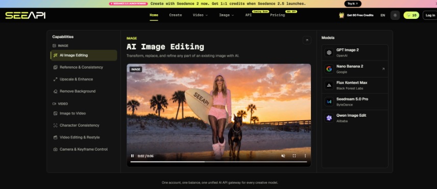
SeeAPI’s public workflow is straightforward enough for a non-engineering content desk: choose an image model, add a prompt or reference, generate and compare, then decide later whether the same path deserves API integration. For course marketing, treat those steps as an editorial loop rather than a demo.
Step One Fix The Teaching Sentence
Do not begin with “make it look premium.” Begin with the one claim the image must support. Example: “Students practice circuit basics on a bench before theory lectures.” That sentence tells you which objects must remain recognizable and which decorative flourishes are optional.
Step Two Prefer A Reference When Accuracy Matters
When the department already has a real lab photo, worksheet diagram, or campus workshop shot, upload it as a reference and ask for controlled cleanup: clearer light, less clutter, or a calmer background. Keep the original source photo open during review. If the generator invents equipment the lab does not own, discard that draft immediately. Prestige fiction creates admissions complaints later.
Step Three Change Only One Variable Per Pass
Use a small test protocol. Keep the teaching sentence and crop fixed. Change the model or the style instruction, not both at once. Otherwise the team cannot tell whether a clearer result came from a better model or from a rewritten brief. Education pages need boring repeatability more than they need surprise.
Step Four Judge The Asset On The Live Card
Place the draft into the course card mock before anyone votes on aesthetics. On catalog pages, a generator preview can still become unreadable once the program title, course duration, and fee note stack into the same crowded card. If the subject cue disappears at that size, the asset failed even if the full-resolution file looked rich.
Catch The Errors That Force Catalog Re-Work
Education teams usually lose time on the same three mistakes. First, approving a hero that cannot shrink into a card. Second, letting decorative text inside the image fight the real HTML title. Third, switching models after the copy is frozen, which creates a new visual language mid-campaign.
|
Error |
What it costs |
Faster check |
|
Hero-only approval |
Card crop loses the subject |
Review at card width first |
|
Text baked into art |
Spelling and resize failures |
Keep words in HTML, not pixels |
|
Model hopping mid-brief |
Catalog looks inconsistent |
Lock brief, then compare models |
These checks sound small, but they prevent the afternoon when five program pages need replacement images because one decorative trend was applied without a crop test. A catalog is a system. One wrong visual language forces re-work across every sibling page that copied the same style for “consistency,” which is how a single unchecked banner becomes a week of replacement labor.
Result Checks That Belong On An Admissions Desk
Judge the keepable drafts in AI API with review language that stays concrete. Ask whether a prospective student can name the subject from the image alone. Ask whether a faculty reviewer would accept the props and setting as honest. Ask whether the same asset can be reused next term if only the intake date changes.
If those answers are yes, the model choice was good enough. If any answer is no, regenerate inside the same workspace instead of opening a second tool that will restart the brief from zero. Consistency across a catalog is an operations problem, and one balance plus one history helps more than a pile of disconnected exports.A final practical pass is worth saying out loud in the content meeting: would a parent or student still understand the subject if the caption were removed? If the image only works with a long explanation underneath, it is decoration, not a course-page asset. That distinction keeps the team from shipping art that looks lively and still creates the same inbox questions every intake cycle.
Publish The Visual Only After The Course Card Still Teaches
SeeAPI fits education content teams that need repeatable image shortlists for course pages, flyers, and social cuts of the same program promise. It is less useful when a school only wants one decorative banner and no review against the live layout.
Keep the loop modest and repeatable: write the teaching sentence, prepare the real crop, generate with a fixed brief, and reject anything that cannot explain the program at card size. Model logos come after that practical filter. The page should recruit students into a clear offer, not into a prettier confusion that admissions must explain later.






This is an interesting use case for AI in education. Developers exploring multiple AI models may also find <a href="https://pinniq.org" rel="nofollow">Pinniq</a> useful as a unified AI API gateway.